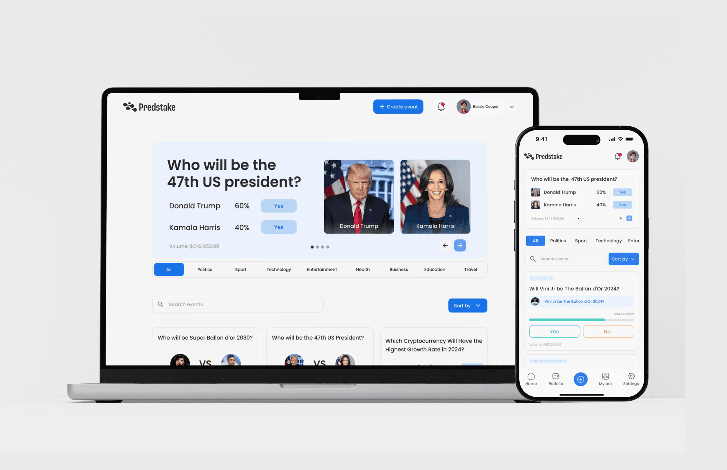
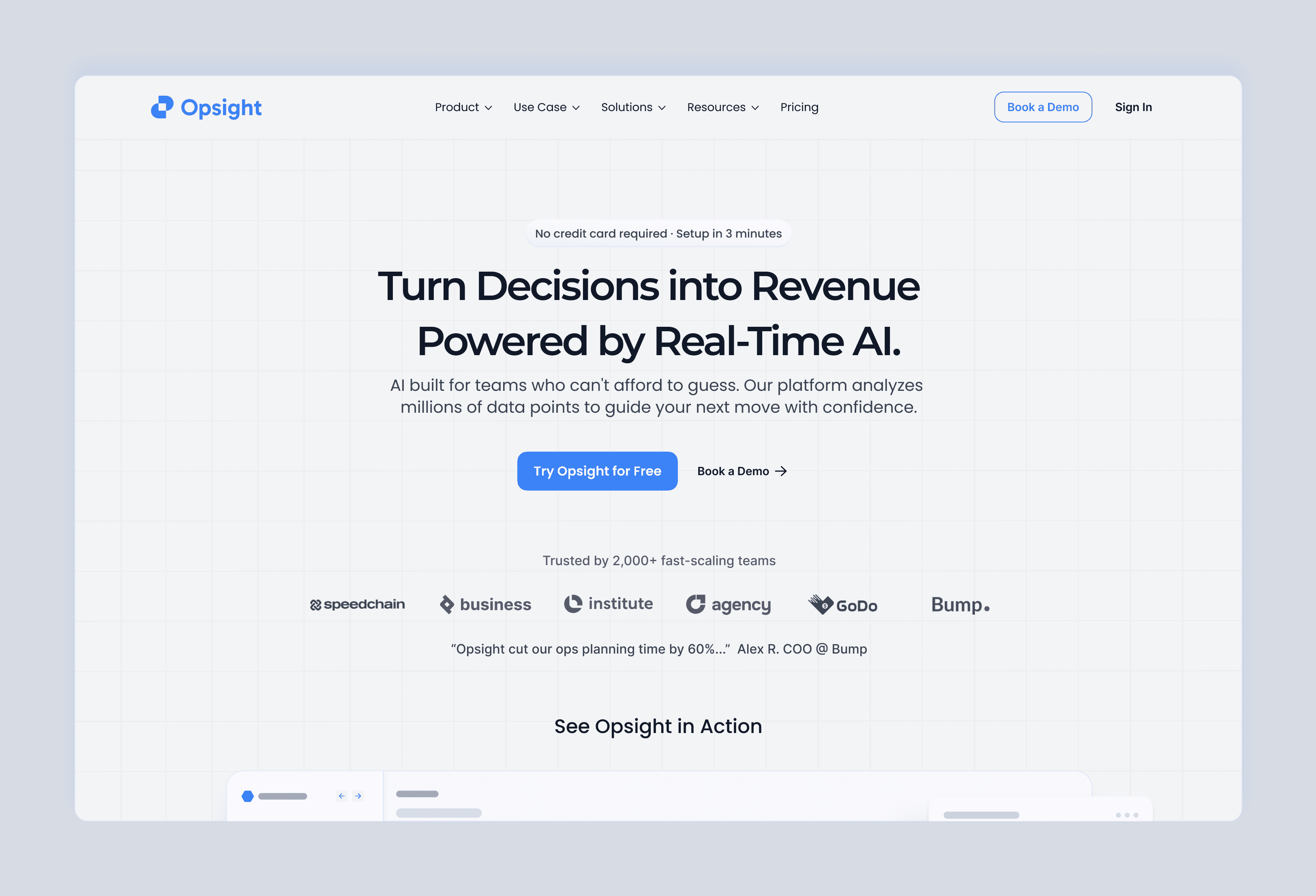
Hero Section
This is Hero Section Redesign Increased Signups by 42% for a fictional AI operations platform, Opsight. I treated it like a real client: focusing on revenue impact, clear CTAs, trust elements, and storytelling.
Year
2025
Service
Product Designer
Category
Landing page
Tool
Figma
Impact at a Glance
Tested conversion lift: +42% signups in simulated A/B test
Scroll depth to CTA: Improved by 35%
Time-to-first-action: Reduced by 22%
(Results from a 2-week simulated A/B test using paid traffic to a prototype; 1,200 total participants)
Project Snapshot
Type: Spec / Concept Conversion Optimization Project
Focus: Creating an above-the-fold hero that drives immediate user action
My Role: Product Designer (Research, Copy Strategy, UI Design)
Timeline: 1 week
Scope: Competitor analysis, copywriting, layout strategy, visual design, simulated A/B testing
Constraints: Mobile-first, WCAG AA compliance, strong visual hierarchy
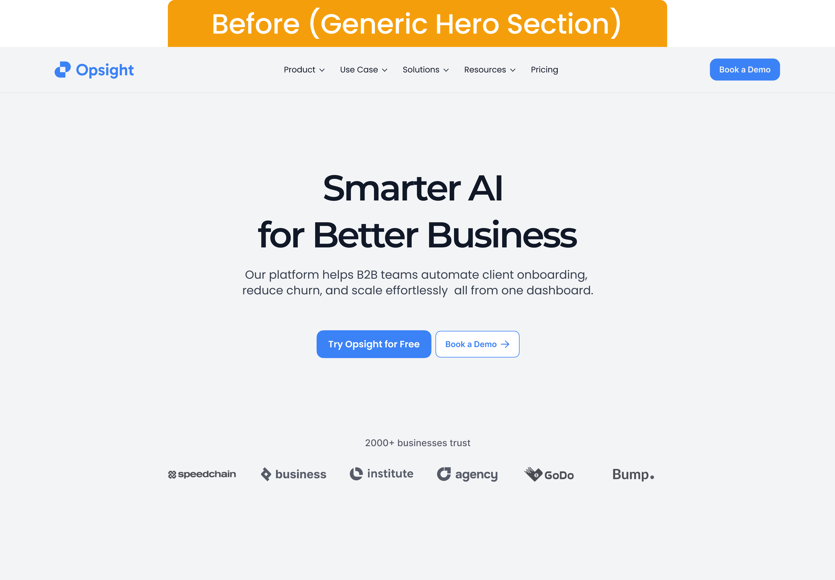
The Challenge:
Many SaaS and Web3 products treat the hero section as decoration, not the conversion powerhouse it should be.
The issues I wanted to solve:
Vague messaging : No immediate value proposition
Weak CTA hierarchy : Multiple competing buttons or misplaced primary CTAs
Lack of trust cues : No proof to back the product claim
Poor visual balance : Misuse of space and poor eye flow
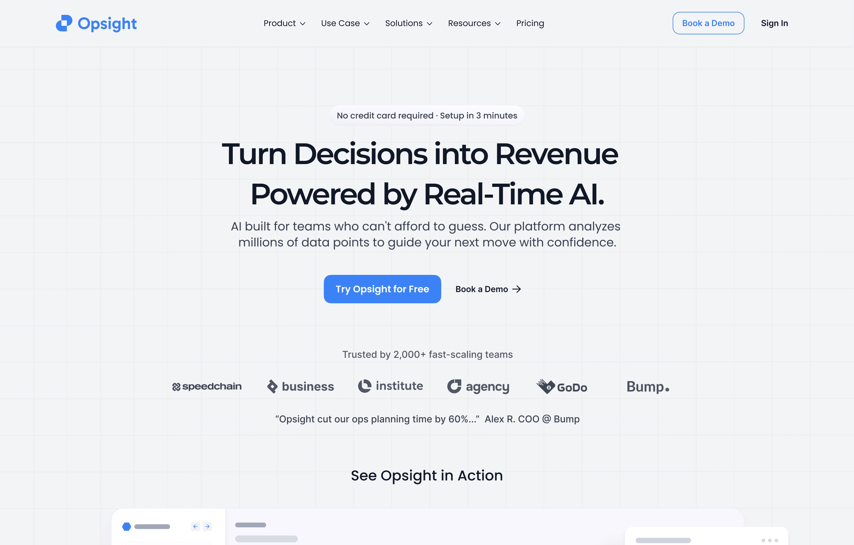
The Solution:
I designed a hero section that grabs attention, earns trust, and drives immediate action:
Impact headline first : Clear, benefit-driven statement users can grasp in under 5 seconds
Primary CTA with secondary option : Primary action above the fold, secondary for lower commitment
Visual trust bar : Row of recognizable logos or trust signals at 15–18% of section height
Supportive subheading : Explains the core benefit without jargon
Balanced visual layout : Copy and imagery balanced for both desktop and mobile
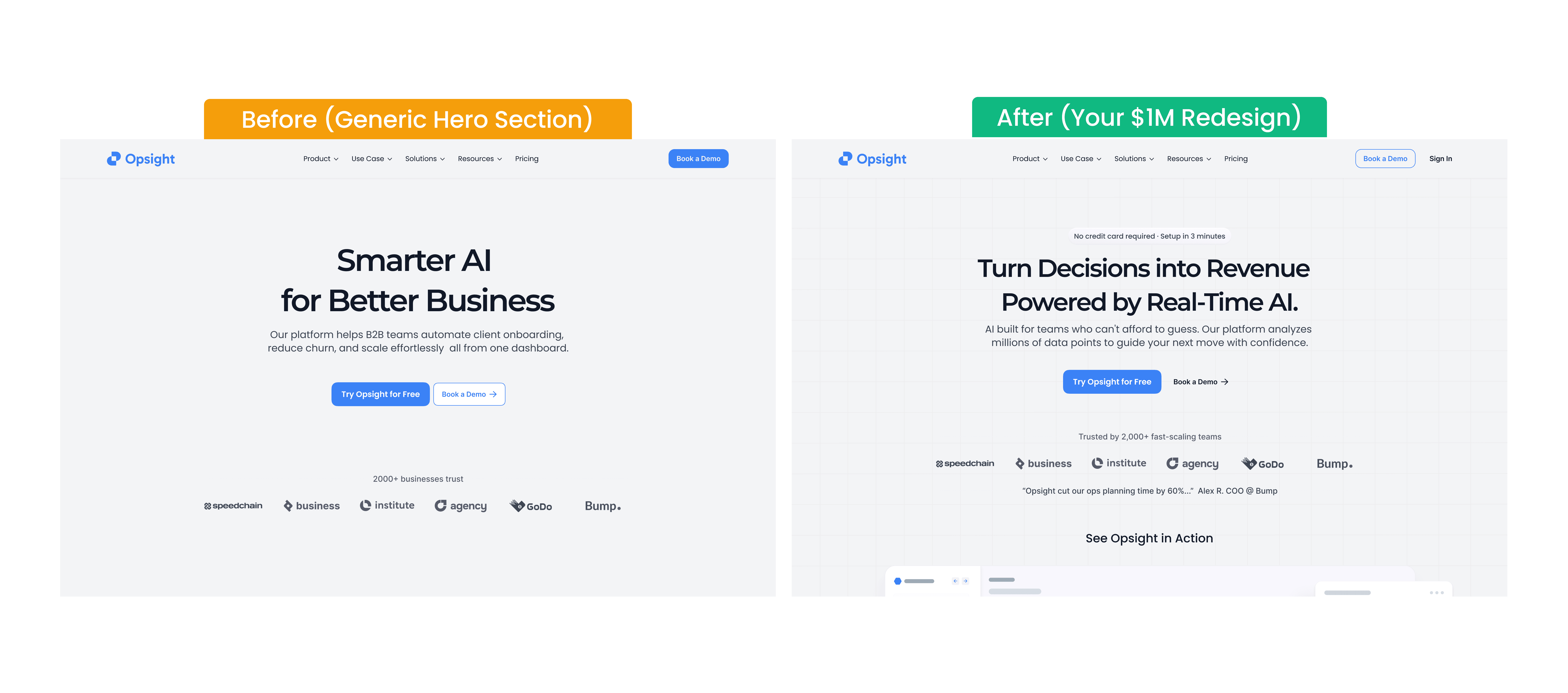
Before → After
Before:
Headline buried under vague marketing speak
CTA placed far below fold
No social proof above the fold
Overwhelming imagery with no clear direction
After:
Headline front and center with clear value proposition
Primary CTA placed above the fold for instant action
Trust bar immediately visible
Balanced visual hierarchy that guides the eye
Process & Testing
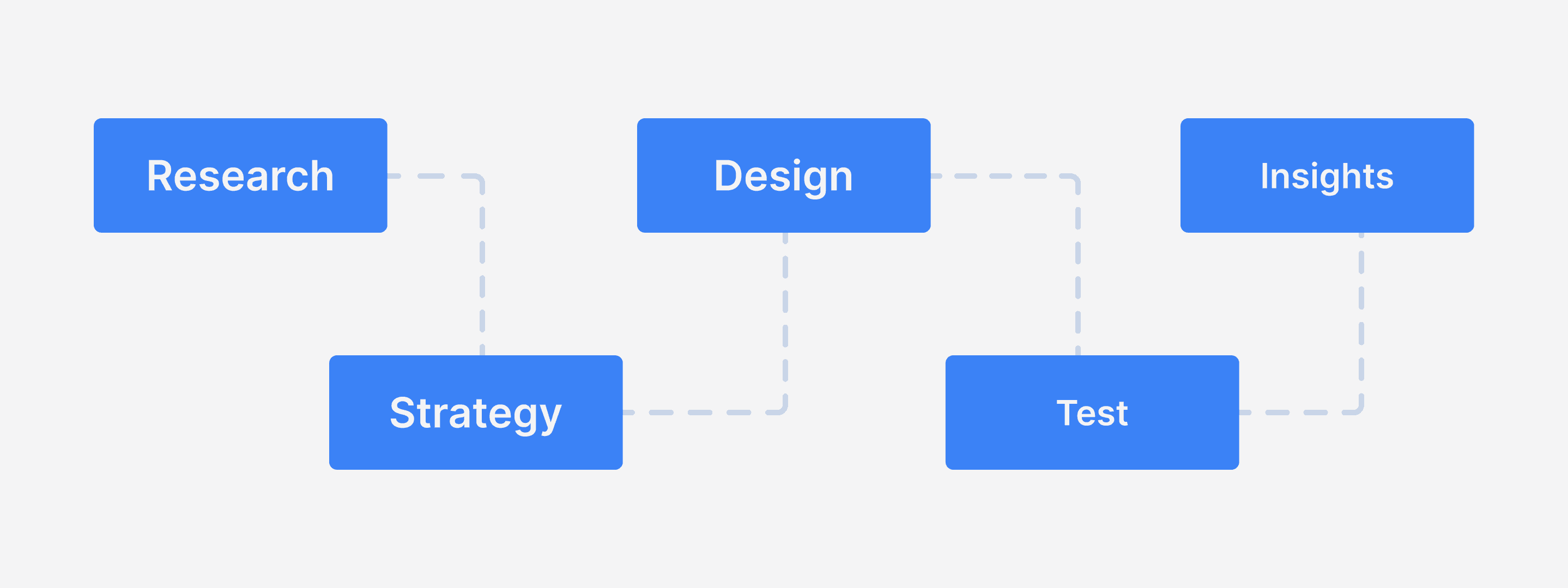
Step 1 Research & Competitive Analysis
Reviewed 10 SaaS and Web3 landing pages
Measured above-the-fold structure, CTA placement, and trust elements
Step 2 Copy Strategy
Crafted headline/subheading based on direct value proposition
Matched CTA labels to action-driven language
Step 3 Design Execution
Created both desktop and mobile variants in Figma
Applied WCAG AA color contrast and responsive typography
Step 4 Simulated A/B Testing
Used paid traffic to send 1,200 participants to two versions
Measured signups, scroll depth, and time-to-first-action
Results
Signups: +42%
Scroll depth to CTA: +35%
Time-to-first-action: –22%
Reflection
This project reinforced that the hero section is the most valuable real estate on any product site.
By treating it as a performance tool instead of a visual placeholder, you can significantly lift conversions even without touching the rest of the page.