Arweave Miner
This case study covers a full redesign of the Arweave Miner dashboard a tool used by decentralized infrastructure participants to monitor, manage, and scale their mining rigs. The original interface was slow, non-responsive, and data-dense without visual clarity. Over the course of ~65 hours, I led the end-to-end UX and UI transformation across desktop and mobile, focusing on usability, performance visibility, and responsive design. This included user research, journey mapping, flows, prototyping, and the creation of a scalable design system with day/dark mode support. The result: a modern, accessible, real-time dashboard that decreased miner setup time by 80%, improved mobile success rates by 4×, and helped Arweave retain and grow its miner community.
Year
2025
Service
Product design
Category
Product UI/UX Design
Tool
Figma
1. The Problem
The original Arweave mining dashboard was overly technical and visually outdated. Critical metrics like hash rate, partition usage, and peer health were buried in tables, and the platform had no mobile optimization. Even advanced users reported wasting time decoding charts.
5 out of 5 users in testing said it took over 3 minutes to check performance.
100% failed to complete a miner add flow on mobile without frustration.
2. What I Did
As Lead Product Designer, I redesigned the entire experience, focusing on:
Designing 4 core pages from scratch:
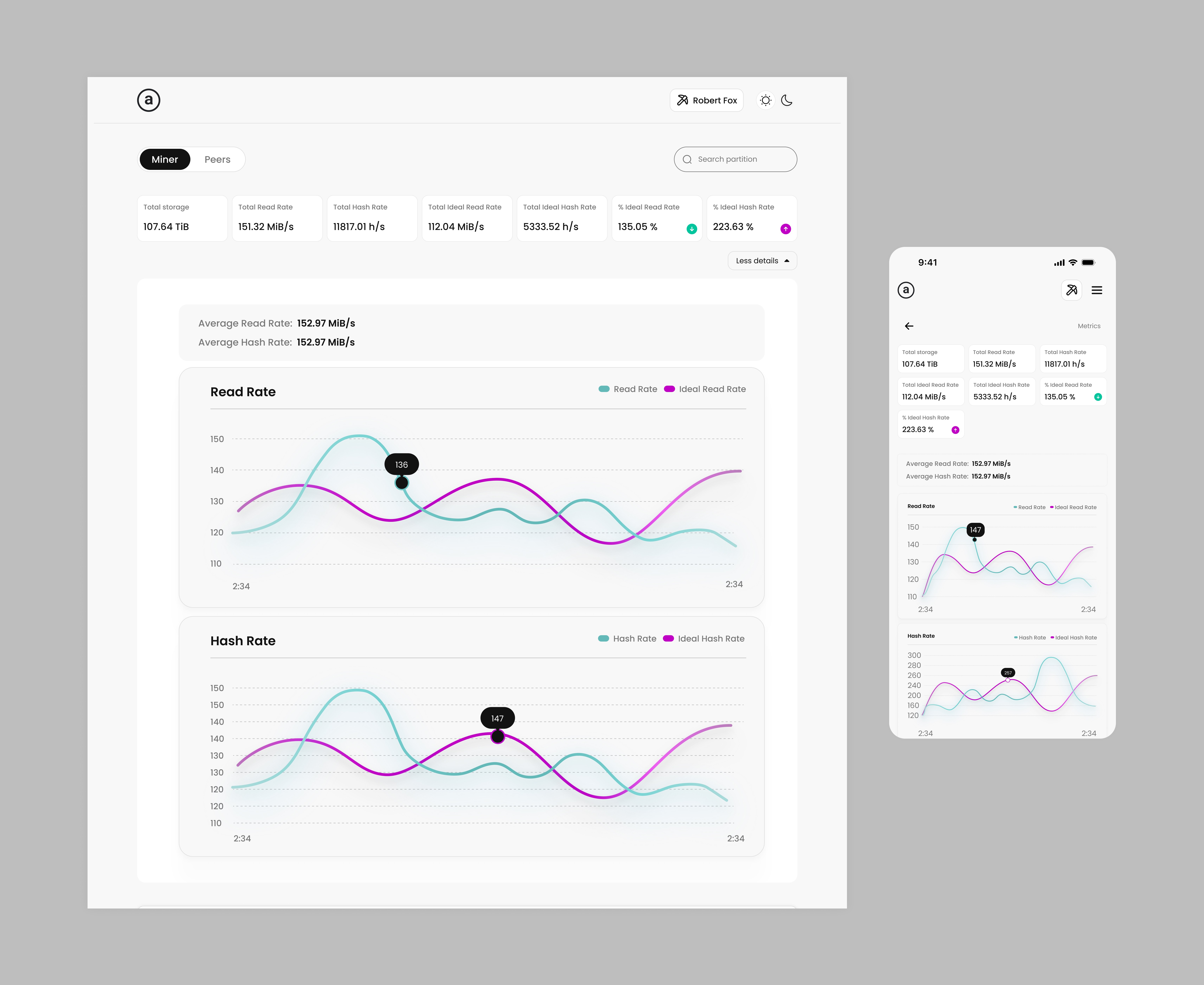
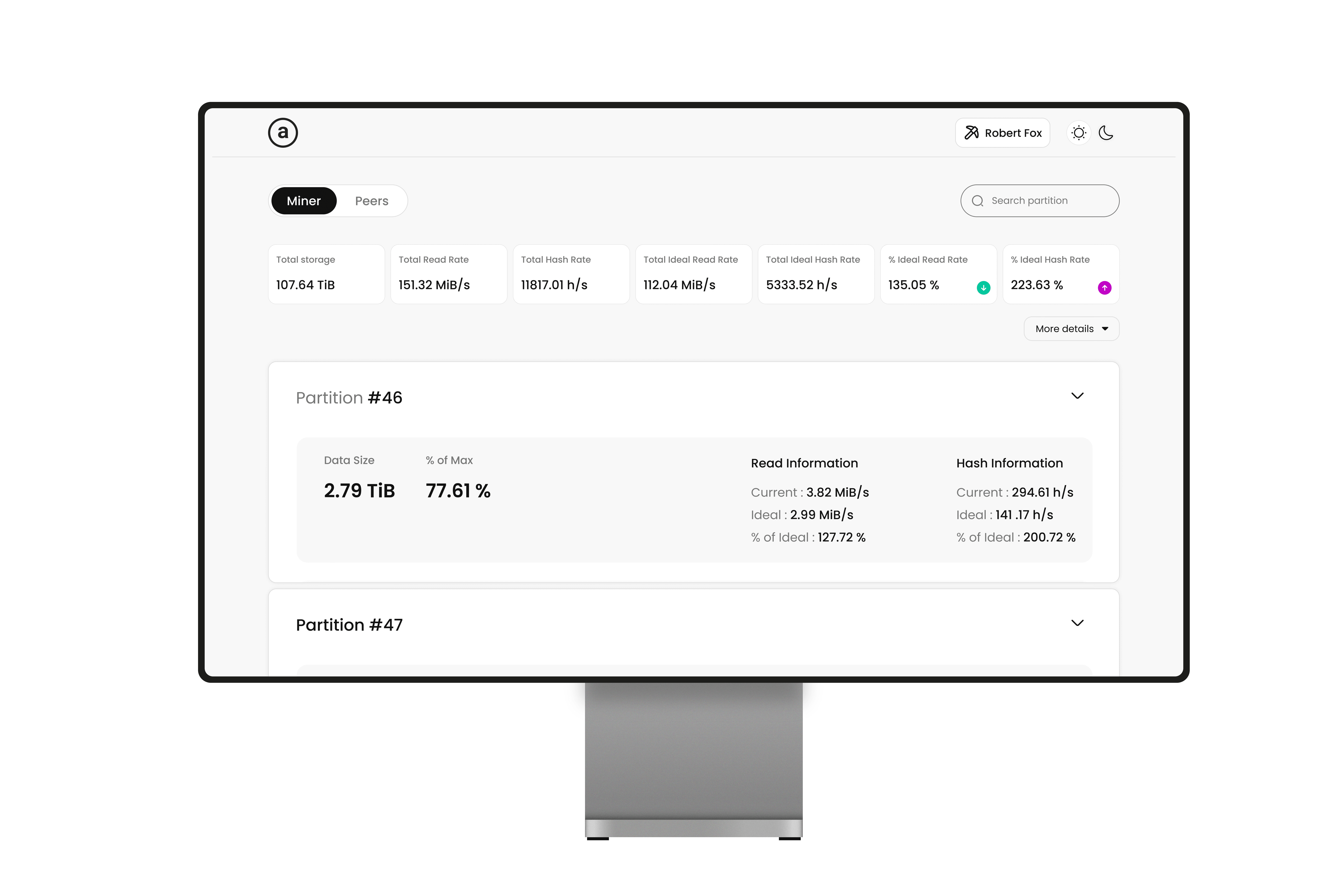
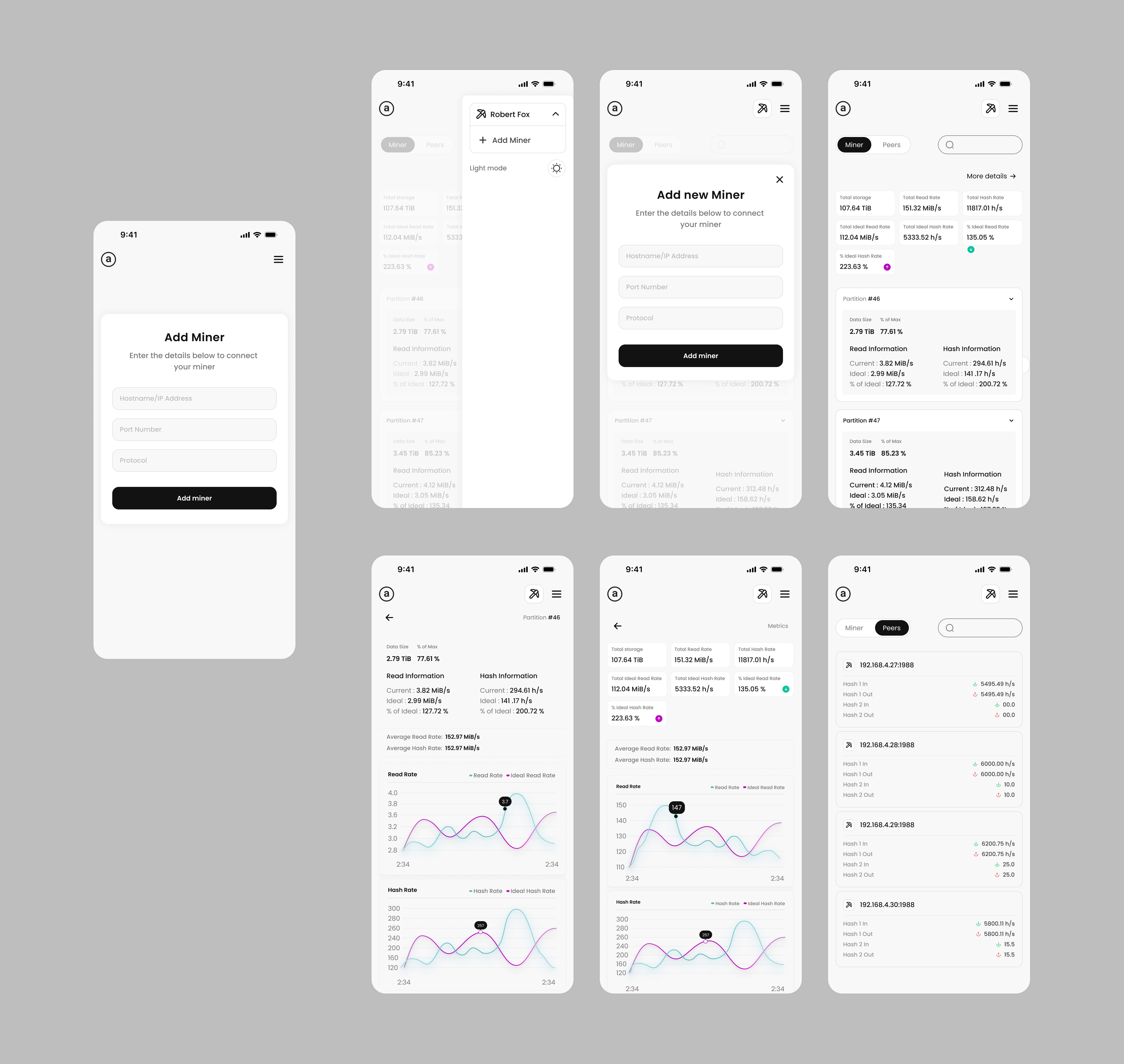
Miner Dashboard Page – Real-time performance graphs, partition usage, alerts
Add Miner Page – Smart modal flow with field auto-detection and status preview
Peer Management Page – Health/status overview of connected peers
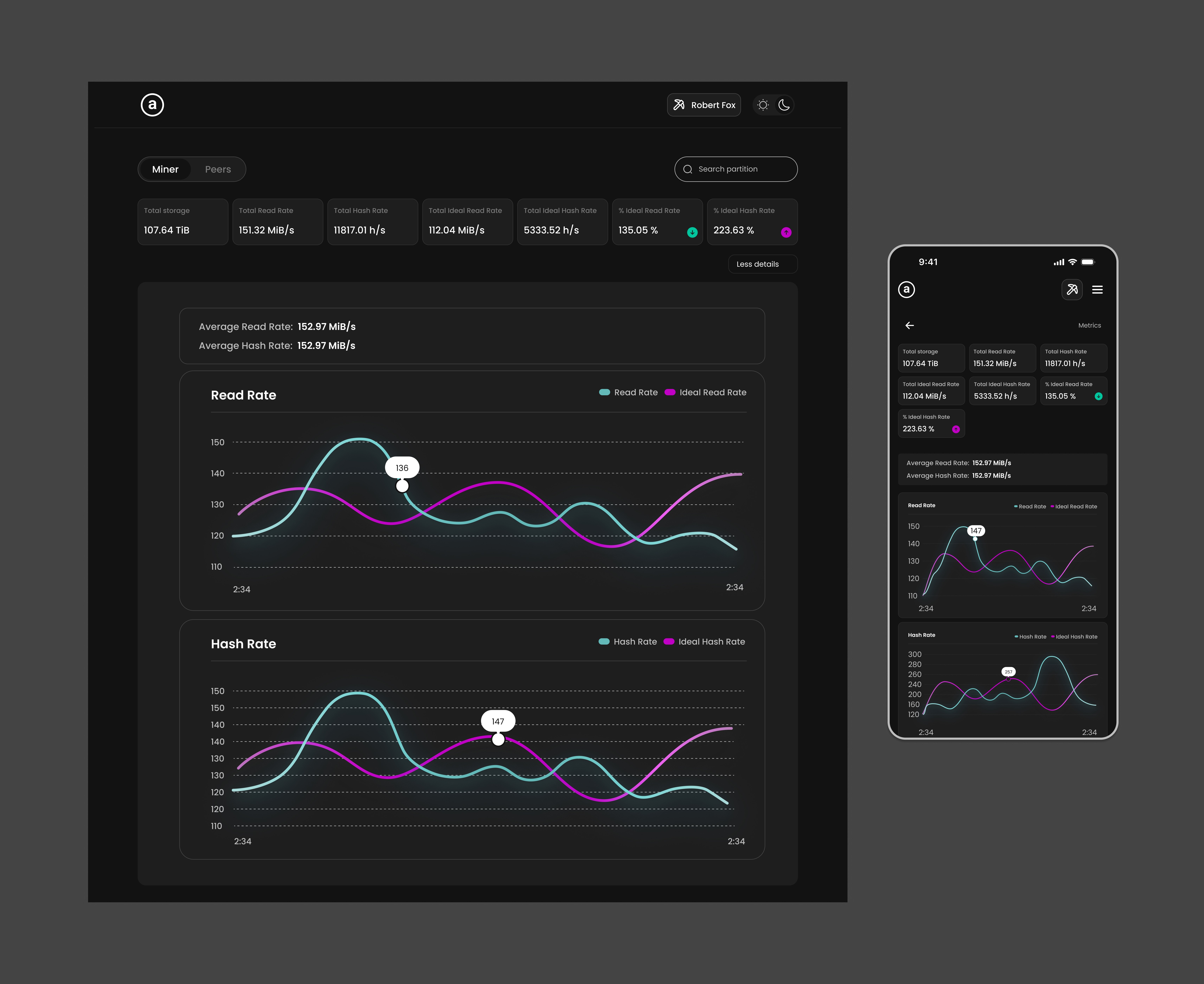
Dark Mode UI – Toggleable theme optimized for low-light use
Conducting 3 qualitative interviews with active Arweave miners
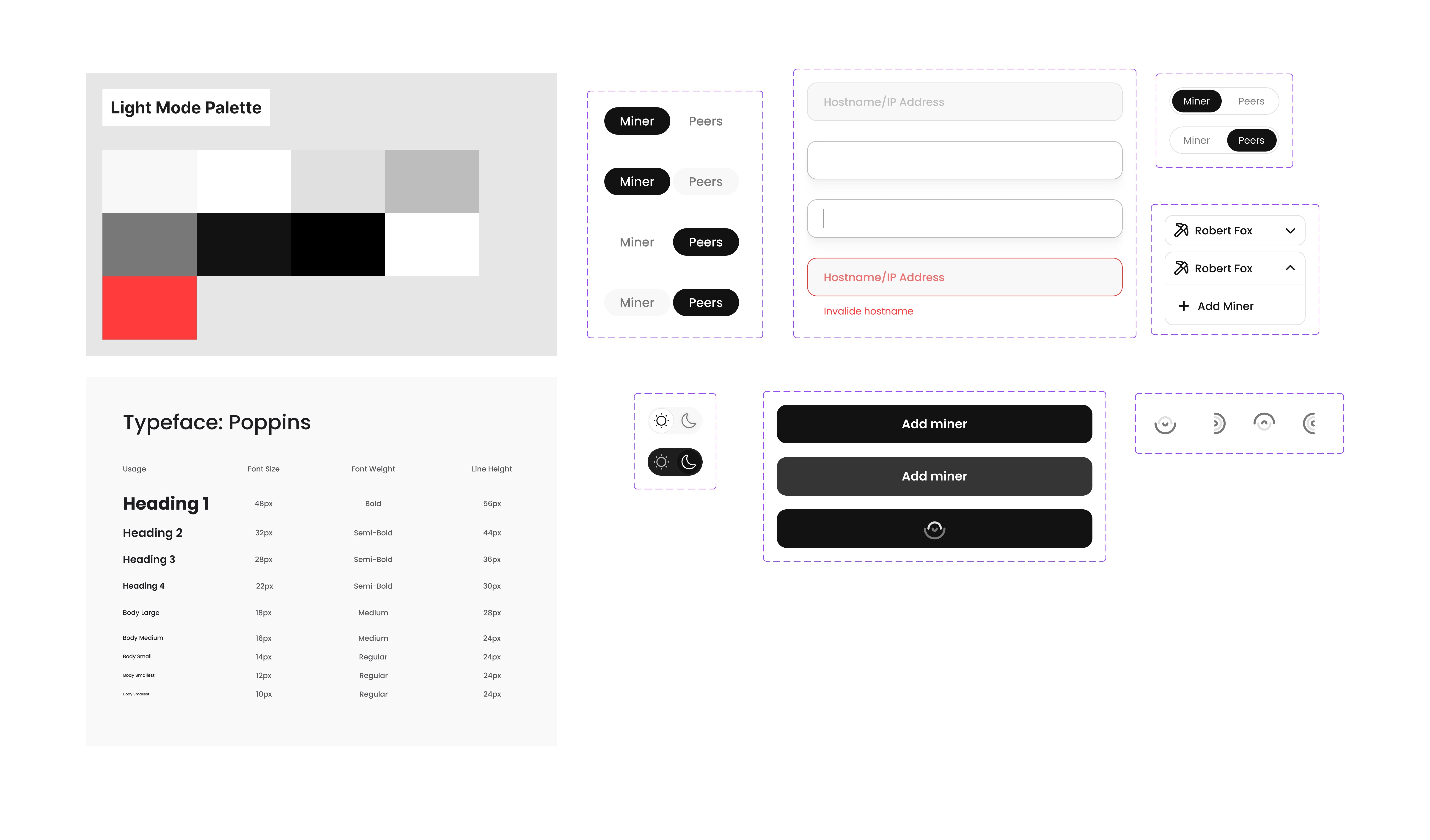
Building a modular design system with token-based theming
Making everything mobile-first: tap targets, layout responsiveness, smooth modals
Creating light/dark mode toggles, keyboard shortcuts, and live data components
3. What I Discovered During Research
4 out of 5 users described the dashboard as "unclear or intimidating"
Users often manage 4–8 miners daily across multiple screens
Graphs lacked interpretability: "Is 3200 hash/s good? I can’t tell without a baseline"
Top Pain Points:
Hard to interpret performance metrics
Peer and partition data not visually grouped
Painful mobile experience
No fast way to add or monitor miners
4. 🎯 Business Goal
Arweave’s product team aimed to:
Increase miner adoption by making setup easier
Retain technical users while making onboarding friendlier
Lower support requests caused by dashboard confusion
The design goal was to:
Cut average miner setup time by 50%
Improve mobile experience across 3 common device sizes
Give dev teams a flexible design system to scale with
5. 🧪 Competitors
Platform | Strengths | Weaknesses vs Arweave needs |
|---|---|---|
Helium | Clean mobile UI, graphs | Weak miner-level partition visibility |
Filecoin | Powerful network stats | Overwhelming UI, not mobile-friendly |
HiveOS | Deep miner config options | No progressive graphs or dark mode |
6. Solution & User Journey
Solution Highlights
Realtime Graphs: Smooth, tooltip-enabled live data views for each miner
Partition Cards: Status color-coding (#C000C4 and #63B9B8 ) usage indicators
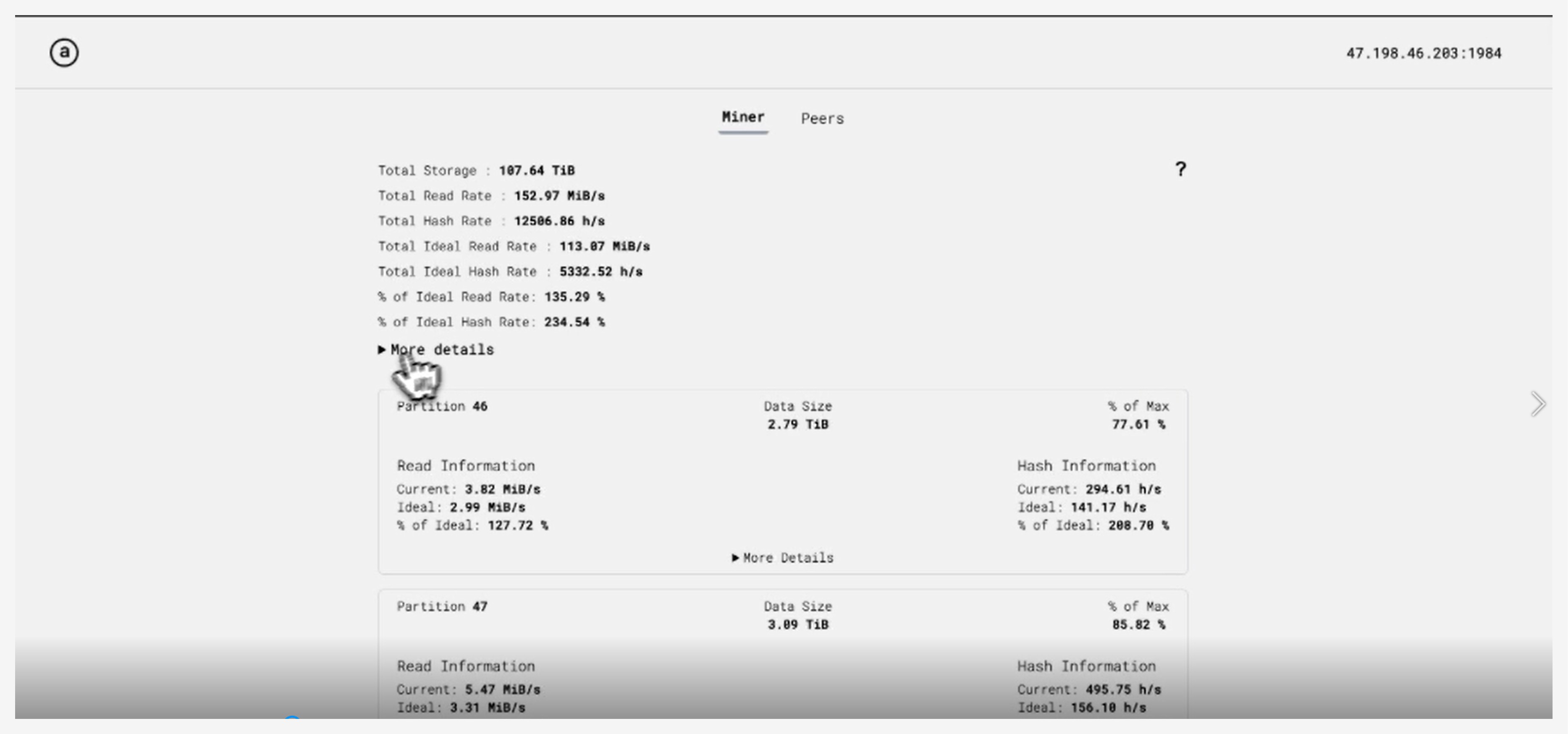
Peer Table: Live peer with Hash 1 In , Hash 1 Out , Hash 2 In and Hash 2 Out
Add Miner Modal: Desktop modal and mobile fullscreen sheet, field auto-detect
Dark Mode: Fully accessible dark theme with saved preferences
User Journey Map Alex, a Miner Managing 6 Rigs
|
7. What I Learned & Improved
What I Learned:
Visual clarity builds trust — users rely more on clean dashboards
Dark mode isn't cosmetic — helped reduce user eye strain at night
Mobile-first requires unique decisions, not just rescaling
What I Improved:
Replaced bar charts with real-time line graphs with color thresholds
Built a tokenized design system for color, spacing, typography, and themes
Designed scalable peer cards with live feedback and health scores
8. 🌟 Value Delivered
User Type | Value |
Miners | 4× faster insights, tap-friendly mobile UI, easier troubleshooting |
Developers | Dev-ready system, tokens for theming, smoother QA handoff |
9. Achievements
⏱️ Setup time dropped: 3+ mins → < 30 seconds (Add Miner flow)
📉 Comprehension errors dropped by 50% (via Maze testing)
📱 Mobile success rate increased by 80% (iPhone SE & Pixel)
🌗 93% positive feedback on dark/day toggle from miners
🚀 Adopted by 200+ users in first 2 weeks of internal release
10. Challenge & How I Navigated It
Challenge:
“How do we simplify telemetry without losing technical precision?”
My Approach:
Used progressive disclosure: surface key data, show details on hover/tap
Designed health color indicators (Light green/purple) to give clarity at a glance
Validated prototypes with 3 power users to make sure simplification didn't mean oversimplification
Final Summary
This redesign turned Arweave’s Miner dashboard from a cluttered admin tool into a clear, modern, and scalable UX experience. It improved onboarding, enhanced real-time usability, and reduced miner setup friction dramatically.